Wednesday, September 23, 2015

The Three Princes: A Tale from the Middle East

Title: The Three Princes: A Tale from the Middle East
Retold by: Eric A. Kimmel
Illustrator: Leonard Everett Fisher
Publisher: New York: Holiday House, 1994
ISBN: 0-8234-1115-X

Plot Summary: A wise and beautiful princess must choose between three suitors: Princes Fahad, Muhammed, and Mohsen. Each prince is an acceptable match by bloodline, but although the princess likes Mohsen best, he is poor and her counselors do not see Mohsen as being the preferable partner. Being wise, the princess must base her decision on more than affection. Therefore she send the princes on a quest to find a great wonder and present it to her in one year’s time—giving Mohsen the opportunity to bring something that will demonstrate his worth to her government. While they are absent the princess becomes deathly ill. Working together and using the wonders they have discovered, the princes heal the princess. Although all were involved in her recovery, Mohsen sacrificed his wonder while Muhammed and Fahad retained theirs. Thus proving his merit, the princess and Mohsen marry.

Critical Analysis: Kimmel and Fisher adaptation of “The Three Princes” captures the essence of the ancient Arabian world and places it in our hands through this picture book. The simple plot—a quest to win the hand of a princess—is made extraordinary by one character, a wise and beautiful princess. She is a strong and subtle leader of her kingdom, able to juggle her heart and her government’s concerns, articulated through her chief minister the wazir. Her personality and power dominate the story; the princes wooing seem commonplace by comparison. At the beginning of the story Prince Mohsen is prominent only because he’s the one she loves. By the end of the story Prince Mohsen’s claim on the princess is still her love for him because although he used up his wonder in healing her, there is no indication that the other princes wouldn’t have done the same.

Kimmel’s text is formal, but not stiff or meager. The story is told as matter-of-fact, even the existence of the magical wonders collected 
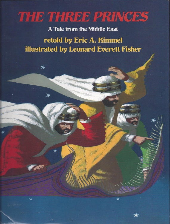
by the princes does not provoke excitement in the reader. The illustrations support the mildness; only the scene depicting the princes flying on a carpet provides any sense of movement or urgency.

Oddly, the calm consistency of the text and illustrations is exactly what the story needs. It evokes the unchanging desert in which the story originates. The illustrations suggest the sand—concurrently smooth and harsh. The chalk medium allows Fisher to smudge and obscure details as well as stipple shadows that seem to be made of black sand. The primary cultural markers are the robes worn by the characters and a crescent moon and star in the night sky.

Most importantly, the tale brings us to a people wise and peaceful. The universality of the themes—wisdom, sacrifice, and cooperation—are appropriate and necessary to all cultures.

Reviews and Awards:
“Kimmel's sprightly retelling of a Middle Eastern folktale and Fisher's ambient artwork shimmer with wisdom and magic.”--Publishers' Weekly

“A smooth, accessible adaptation, much enhanced by the spare, powerful art.”--Kirkus Review

Eric Kimmel has received numerous awards for his books, including: Caldecott Honor Medal, Sydney Taylor Picture Book Award, National Jewish Book Award (twice), and the Naylor Award.

Leonard Fisher has received numerous awards as well: 1950 Pulitzer Prize for Painting, Arbuthnot Citation, National Jewish Book Award, Christopher Medal for Illustration, and many others.


Discussion Prompts: (adapted from Hampton-Brown teacher guide) 
Is it better to work together or alone? When?
How would the three princes answer this question? 
The three princes have to work together. Have you ever had to work in a group to solve a problem? What did you like about it? What did you not like? 
What if only two of the princes agreed to work together and the third did not?

Lesson Plan about Middle Eastern Folk Tales:
http://www.csames.illinois.edu/documents/outreach/Middle_Eastern_Folk_Tales_Lesson_Plan.pdf

Created for course 5603.21 at Texas Woman's University

Pig Pigger Piggest

Title: Pig Pigger Piggest
Author: Rick Walton
Illustrator: Jimmy Holder
Publisher: Salt Lake City: Gibbs Smith, 1997
ISBN: 1-58685-318-X

Plot Summary: “Once upon a time, there were three pigs: a big pig named Pig, a bigger pig named Pigger, and the biggest of the three named Piggest.” The three pigs lived in a castle with their father and mother, the King and Queen. One day the King told his dear piggy babies that they were grown up now and needed to build castles of their own. Pig found a nice mud pit and went to work, building a very fine castle of mud-bricks. Pigger found a nicer mud pit and went to work, constructing a grander castle of mud-bricks. Piggest found the nicest, muddiest spot and built the biggest mud-brick castle of all. They were all happy until the fateful day each was visited by a witch—sows by the name of Witch, Witcher, and Witchest. Witch visited Pig, Witcher visited Pigger, and Witchest visited Piggest. The witches wanted the castles because building was not in the witch skill set, but the brothers refused. Miffed, the witches called upon their pet elements, Puff, Puffer, and Puffest, to blow and rain down the castles. The brothers, immensely impressed by the resulting mud pits, sought out the witches and proposed marriage. “And they all lived sloppily ever after.”

Critical Analysis: The tale of the three little pigs is firmly entrenched in the literary world of children; Pig Pigger Piggest is a rollicking version of good and muddy fun. Walton’s text and Holder’s illustrations turn the tale from the traditional construction materials (straw, sticks, and bricks) to the size of the constructions. The big, bad wolf becomes three dumpy witches. Elemental weather beings controlled by the witches take care of the huffing and puffing. The pig brothers are smarter than those in the original story because they all use bricks, although the bricks aren’t the quality kiln-fired type. The witches are nicer than the wolf; the witches are after property, not pork. Even without successfully gaining their objectives, the witches prove they can certainly take care of themselves.

Walton’s text trips from the tongue. He breaks the grammar rule of comparison by adding –er and –est to nouns as well as adjectives; the results are funny sounding and even young children recognize that something silly is happening to the words. Each pig’s episode echoes the previous, the primary change occurring in words of comparison. With its strong, simple story and its back-and-forth dialogue, Walton’s text could stand alone, but the illustrations take the story to the next level of enjoyment.

The sketch-like illustrations are best described as cheerful and rotund, appropriate for a light tale about big pigs. Holder’s pictures support Walton’s comparison-based text and add a touch of personality to the characters. The pigs, settings, and whimsical details grow larger on each spread; Piggest’s final mud pit runs right off the page! A sense of the characters’ dispositions is shown primarily through their expressions. For example, thanks to their uncertain smiles and shyly hopeful eyebrows, the witches could never be considered evil.

The text is fun, the pictures are funner, but the funnest aspect of the book is the recognition that in spite of their anthropomorphism, the characters are, after all, still pigs.

Reviews:
" …Walton's (You Don't Always Get What You Hope For) playful progressive comparisons are enjoyably goofy… Perhaps not the funniest, it's funnier than many; and definitely a funny book." - Publisher's Weekly

“This book is filled with both real and nonsense examples of comparatives and superlatives. The funny illustrations, rich language and surprise ending will engage all readers and listeners.” - www.librarything.com

“Walton's superlative reframing of the classic three pigs story could be criticized for its disjointed narrative. But the fact that the story has no point and makes little sense is exactly one of the reasons why it's funny to young children. The superlatives strengthen the rhythm, making this a great book to read aloud.”—Panguitch, epinions.com

More by Walton and Holder:

Why the Banana Split 
Gibbs Smith, 2005 ISBN 978-1586858414
Amazon.com description: So why did the banana split? Well, for the same reason that the jackhammers hit the road, the lettuce headed out, and the jump ropes skipped town. It was even enough to make the baseball players strike out. Here's a hint: it's bigger than a breadbox. And named Rex. With Jimmy Holder's sly illustrations bringing every pun to life, Rick Walton's verbal deftness will leave readers splitting too-their sides.

That’s What You Get. . .!
Gibbs Smith 2000, ISBN 978-0879059644
Amazon.com description: A zany mother's rhyming explanations for why things happen

Created for course 5603.21 at Texas Woman's University

Tuesday, September 22, 2015

Joseph Had a Little Overcoat


Title: Joseph Had a Little Overcoat
Author: Simms Taback
Publisher: New York: Scholastic, 2000
ISBN: 0-439-21697-4

Plot Summary: “Joseph had a little overcoat. It was old and worn.” So begins Simms Taback’s adaptation of the traditional Yiddish song “I had a Little Overcoat”. Joseph’s coat is tattered, so Joseph uses his tailoring skills to constantly recreate his favorite apparel into a progressively smaller form. Soon nothing of the coat remains. But that’s not the end! Joseph shows us that something can be made from nothing.
Critical Analysis: Reminiscent of the song lyrics, the rhythmic text and repeated elements make Joseph Had a Little Overcoat a joy to both read aloud and hear. The text’s predictable nature also makes it easier to appreciate the real magic of the book—the illustrations. Taback’s illustrations place the very poor tailor Joseph as part of an Eastern European Jewish community sometime during the late 1800’s to the early 1900’s—the very same culture from which we receive the song.
Using primarily watercolor and collage, Taback’s spreads are packed with details. Younger children will delight in giggling at cartoonish figures and in finding the photographic images in the collage. Older children, including adults, will be intrigued by all the cultural details—a fiddler on the roof here, a Yiddish magazine there.  However, the real excitement occurs with the die-cuts. Overlaying every other illustration with a die-cut creates a jacket from a coat, a button from a handkerchief, and all sorts of items in between.
The moral, “You can always make something out of nothing” is lightly presented, but multi-layered. Creativity and positive attitude will win the day! Joseph Had a Little Overcoat proves it.
Reviews and Awards:
2000 CALDECOTT MEDAL
Barbara Kiefer, chair of the Caldecott Award Committee, commented, "Vibrant rich colors, playful details, and skillfully-placed die cuts contribute to the books raucous merriment that takes this Yiddish folk song far beyond the simple words."

Linda Ludke for School Library Journal writes, “A book bursting at the seams with ingenuity and creative spirit.”

Publishers Weekly states, “With its effective repetition and an abundance of visual humor, this is tailor-made for reading aloud.” 

Music Video:
See Scholastic’s animation of the song using Taback’s illustrations. The score is authentic klezmer music of the Yiddish original.
http://www.simmstaback.com/Simms_Taback_Videos_-_Joseph_Had_a_Little_Overcoat.html

Related Lesson Plans:

In the words of the artist:
            “Joseph Had a Little Overcoat is adapted from a Yiddish folk song and is a good example of yiddishkayt, meaning “Jewish life or Jewish world-view.” It embodies the values and struggles of life in the shtetl—the small villages where Jews lived in Eastern Europe. These were not big-city Jews, but families of farmers and tradesmen of mixed economic classes.”
            ---Excerpt from Taback’s Caldecott Award acceptance speech, see more at http://www.simmstaback.com/Simms_Taback_Caldecott_Medal.html

At the end of the book Taback includes some nice bonus features for the adults and older children. One is a letter explaining why he chose this particular song to illustrate and his feelings regarding the finished product. The other is the sheet music (tune only) to “I had a Little Overcoat”.

A question for you: 

People sometimes see Simms Taback in his illustration of Joseph. What do you think?
(images from pbskids.com and simmstaback.com respectively)


Review created for course 5603.21 at Texas Woman's University

Wednesday, September 9, 2015

The Tale of Peter Rabbit

Title: The Tale of Peter Rabbit

Author: Beatrix Potter

Publisher: London: Warne, 2002

ISBN: 978-0-7232-4770-8

Plot Summary: 
Peter’s mother needs to run some errands. She leaves her four children at home with a warning not to go to Mr. McGregor’s garden. Peter’s sisters are well-behaved and find something useful and safe to do while mother is away. Peter, a very naughty bunny, immediately heads to Mr. McGregor’s vegetables. He gorges himself and then has a run in with Mr. McGregor, who is none too happy to have a rabbit in his vegetables. Peter goes on the run, gets trapped, escapes, gets lost, and finally makes it home. He is so worn out from his adventure that he falls right to sleep without eating supper.

Critical Analysis:  The Tale of Peter Rabbit was first published in 1902 and is considered to be the first “perfect” picture book. It is the ideal mix of text and illustration, each offering just enough to make the whole greater than the sum of its parts.  The whole is a children’s book clearly and beautifully crafted for the young reader. The choice of a bunny for the main character is the first proof of the intended audience. A bunny is appealing to children because it share the same small size and vulnerability as a child.   As for the plot, it boils down to essentially a game of “chase”.  Children almost universally love to play “chase” and Peter’s escapade may be seen as an elaborate game.  The plot as a game of chase is reinforced by the lack of any enduring consequences for Peter’s disobedience. In other words, he got away with it. A delightful concept for a child—hopefully a concept most children rarely experience.

Beatrix Potter wastes no words on descriptions. Her text is forthright, never condescending, and strictly narrative. The only word our protagonist utters is a sneeze—“Kertyschoo!” When divorced from the illustrations the characters become flat. The mother is matter-of-fact and almost comes off as uncaring because she leaves her children unattended for the day and seems to have a minimum of concern as to what Peter’s been up to, especially considering she knows that he is a “naughty” bunny. Peter’s sisters get little more treatment than names and the description of “good little bunnies”. Mr. McGregor is the monster whose only role is to imperil Peter. Peter is concretely described as a “very naughty” bunny and his motivation is no greater than to break the rules and fill his tummy with Mr. McGregor’s vegetables. If the illustrations are separated from the text the story becomes choppy, jumping from one scene to another with minimal continuity.

Together the illustrations and text create a rural world where bunnies wear clothes and farmers aren’t surprised by it. The illustrations greatly expand the text. We learn the time period from the mother’s dress, apron, and mob cap. The rural setting is fleshed out with texture and detail. Peter Rabbit gains sympathy because you can see the little tears dripping down his face when he is frightened and alone. The pictures expand the immersion of the child into the story. In a sense this is the first seek-and-find picture book—a child can look for Peter’s shoes as he loses them, or his ears revealing his hiding place in the watering can as Mr. McGregor pursues the little rabbit. Another source of fun is looking for Peter’s sisters in the scenes set at their fir tree home; they are often obscured in the background.
The single picture per page spread drew attention to the delicate details of Potter’s marvelous watercolors. I saw miniature paintings, each worthy of being framed and hung on a wall—pictures I would not tire seeing because of their natural detail and pleasing color palette.  Potter’s talent as a nature artist is abundantly clear. Watercolors are rarely vibrant and the feathering of edges into the surrounding white space further softens the illustration.  The juxtaposition of the unrelenting hardness of nature with a glowing, gentle media is interesting. 

The pacing of the work was excellent. It’s not a page-turner, perhaps because Peter Rabbit has been around long enough to be in the collective memory of our culture. We know he doesn’t die, so there is no heightened tension. However, the action of turning a page between each scene gave the tale a passage of time.

From the universality of a “chase” based plot to the perfect marriage of text and illustration, The Tale of Peter Rabbit earns its stellar reputation.

Awards: This classic tale was published before major literary awards for children’s literature were established.

Additional Review:
Scholastic: “Since it was first published in 1902, Beatrix Potter’s The Tale of Peter Rabbit has become one of the undisputed classics of children’s literature—so classic, in fact, that generations of children have grown up thinking of it as a traditional folktale. But the exciting story of the mischievous rabbit and Mr. McGregor is very much an original, and part of the genius of Potter’s invention is that her combination of words and pictures can seem new and familiar at the same time.”

 Food for Thought:
 In the century plus that has followed its publication the tale has been dissected in a plethora of ways, each examiner looking for that fresh perspective, an original thread to follow. If you were looking for hidden meanings, what direction would you take? For example, how does the loss of Peter’s clothes illuminate his descent from a confident rascal to a weeping wreak?

An AHA! Moment:
 I had a powerful experience regarding the importance of the format of the book. Initially I read this story as part of a Beatrix Potter collection. In order to put as many stories in the volume as possible, each page had several illustrations and paragraphs. It was boring; I found myself skipping sections just to get through it. I thought to myself, “There is NO way this book could have such a profound impact on the world in this format.” I took myself to Barnes & Noble and purchased a reproduction of the original. It made all the difference.


Review created for course LS 5603 20-21 at Texas Woman’s University

Today I Will Fly!

Title: Today I Will Fly!

Author: Mo Willems

Publisher: New York: Hyperion, 2007

ISBN-13: 9781-42310295-3

Plot Summary: When spirited Piggie decides that she will fly, her best friend Elephant is outright antagonistic to the idea. “You will never fly!” he cries. Piggie is indomitable—she will fly! Elephant looks skeptically on while her various attempts yield no results—until she enlists another friend to help.

 Critical Analysis: Mo Willems’ Elephant and Piggie books are a modern staple for emerging readers. The illustrations are simple, the text simpler, yet in just a few artistic lines and simple sentences a story of friendship and imagination unfolds. Each book examines an aspect of friendship; problem-solving, anger, and comfort to name a few.  Today I Will Fly! is the first book in the Elephant and Piggie series and examines support. Willems readdressed this aspect of friendship in 2009 with Elephants Cannot Dance!

The characters of Elephant and Piggie can be summed up in few words. Elephant is a pessimistic, realistic, introverted, and loyal. Piggie is an optimistic, exuberant, extrovert who makes friends easily, yet is unswervingly devoted to her best friend Elephant. Their sincere friendship is their defining quality. The simplicity of the characters makes them easy to understand and love—an essential feature of quality books for young children. 

Today I Will Fly! demonstrates a stress on friendship. Elephant will not support Piggie’s dream of flight, and tells her so in no uncertain terms. Piggie listens to Elephant carefully, but ultimately decides she can at least try to fly. The characters could allow the disagreement to drive a wedge between them, but they do not. Although Elephant never offers his help to Piggie, Piggie is confident enough in herself and her friendship to move ahead with her idea. The breakthrough moment for Piggie is actually triggered by a sarcastic remark by Elephant. A take-away from the story from Piggie’s perspective is to follow your dream in spite of the ridicule of others, even that of your friends. Elephant learns that you should never underestimate your friends.

The outstanding quality of Willems’ Elephant and Piggie books is the perfect marriage of text and illustration. As an illustrator Mo Willem’s style is distinct and spare. Flat pencil drawings of Piggie and Elephant are often the only illustration on a page. Backgrounds are non-existent; even a horizon does not make an appearance. The characters remain grounded by a consistent bottom margin. The key indicator of height is a squiggly black line representing a shadow. Extensive white space helps the young reader to remain focused on the reading experience, yet the simply drawn characters are not a distraction. The spare nature of the illustration makes every detail significant. From Elephant’s defiant stance with his hands on his hips to Piggie’s appealing lean as she asks a pelican for help, the body language is portrayed simply and accurately. The primary emotional cues of the book rest on three lines per character—the eyebrows and the mouth. Additional lines represent movement, reminiscent of newspaper cartoons such as Peanuts and Family Circus.

In addition to the illustration of the characters, Willems uses the words themselves as graphic elements. The top half of each page is reserved for the test, emphasizing the equal importance of text and illustration. The text is entirely dialogue, differentiated by the cartoon staple of the voice bubble. In addition to the traditional tail of the bubble pointing toward the speaking character, the dialogue bubbles are color-coded. Pessimist Elephant’s words are gray and exuberant Piggie’s bubbles are pink. The lack of traditional text indicators of speaking character (i.e. he said/she said) allows uninterrupted dialogue and supports the quick pacing of the story. In addition to the effective use of the dialogue bubble, Willems uses the font size to cue emotion. The larger the letters, the louder the character is speaking. The text treatments make Elephant and Piggie books excellent read-alouds.
Setting aside the graphic elements of Willems’ voice bubbles allows one to examine the construction of the text. He uses the repetition of a handful of simple words to great effect, making him a true heir to the legacy of Dr. Seuss.

Awards: The Elephant and Piggie series received the 2008 and 2009 Theodor Seuss Geisel Medal, a honor awarded for the most notable early reader book published during the previous year. Elephant and Piggie books have also won Geisel Honors 2011-2015. Mo Willems has garnered the Caldecott Honor three times for his delightful children’s books. Prior to reinventing children’s literature Willems earned six Emmy Awards for his writing and animation on the venerable Sesame Street children’s television program.

Additional Review:
Booklist: “Accessible, appealing, and full of authentic emotions about what makes friendships tick, this will put a contemporary shine on easy reader collections.”

In the Words of the Author/Illustrator:
“Oh, I’m no artist . . . I’m a utilitarian craftsman. My job is to construct solidly, well-built stories and drawing to be used and reused by kids and grown-up. An artist is concerned with making his audience understand him, a craftsman is concerned with understanding his audience . . .The only rule I set for myself before starting is that the star of each book should be designed in such a way that anyone can draw him or her.”

From an interview conducted by Sujata Shahane for the National Center for Children’s Illustrated Literature (NCCIL).  September 2008. www.nccil.org/experience/artisits/willemsm/. Accessed 9/9/15.


Review created for course LS 5603 20-21 at Texas Woman’s University

Tuesday, September 8, 2015

A Ball for Daisy

Title: A Ball for Daisy
Author: Chris Raschka
Publisher: New York: Schwartz and Wade, 2011
ISBN: 978-0-375-85861-1

Plot Summary: Daisy is a sweet little dog who loves her red ball, but one play day at the park things go dreadfully wrong and POP! The ball is no more. She is heartbroken. We follow Daisy through her mourning and her return to joy as she discovers that she has friends who truly care for her. And she gets a new ball.

Critical Analysis: Told exclusively through Chris Rashka’s lively impressionist illustrations, A Ball for Daisy delights the young reader, with a publisher-suggested age range of 3-7 years old. However, I find the tale especially suited to 2-5 year-olds because of the many commonalities between Daisy and themselves. Young children quickly identify with Daisy, who shares their short stature, lack of verbal skills, and enthusiasm. The young child empathizes strongly with Daisy’s emotional swings from exuberant joy to despair and back again. Another similarity to young children is Daisy’s strong attachment to a favorite toy—in her case a bright red ball.

Daisy plays with the ball, she sleeps with the ball, and she takes the ball with her when she and her owner go out. Daisy thinks the world of her ball, and the illustrations subtly confirm her world view as backgrounds are frequently simple circles of hues using the wet-on-wet watercolor technique, softening and blending the edges yet retaining the curved shape. Rashka’s watercolor illustrations imbue the tale with pastel tonalities and plenty of white space. The exception of the pastel hues is her bright red ball, befitting the emotional driver of the tale. The pastels are sunny while Daisy plays with her toy, but gradually darken as conflict with another dog leads to the destruction of the ball. Grays begin to overpower the dominant pale yellow, lending gravity to Daisy’s misery. Immediately upon the replacement of her ball, Daisy’s fur returns to a bright white.

Raschka reaches out to the young reader through the bold, wavy brushstrokes used on Daisy. The wiggliness of the line not only adds appealing frenetic motion to the dog, but also invites the child to adopt Daisy as their own creation. They see their own inexact artwork echoed in the perceived lack of precision. Raschka imbues Daisy with emotion through the perkiness of her ears and tail when she is joyous, and the droop of the same when she’s sad.

Rashka’s uses point-of-view masterfully. The illustrations show the world from Daisy’s perspective—people and landscapes are seen only from the shoulders down, the same view a child. Initially Daisy needs no other point-of-view because all she needs is her ball, and that resides near the ground. It is not until Daisy has been mourning the loss of her ball for a while that her plane of vision expands. Her owner, a little girl, sits with Daisy and offers comfort. It is intriguing that Raschka chooses this moment to fully introduce a character that until this point existed only from the shoulders down, yet has such a powerful influence over Daisy’s life, much like a child doesn’t realize the importance of a parent until the child feels a need.

The low viewpoint makes multiple horizontal rows and excellent choice for moving the plot along. The illustrations alternate between horizontal panels and full pages; full-page illustration is used to emphasize key emotional moments such as a peaceful dream with the red ball or the excitement of an imminent walk. The moments of conflict are played out in a single illustration spreading over two facing pages, thus calling attention to Daisy’s dismay over her ball. Once Daisy is urged to go out again, the resolution plays out in full panels.

The plot is simple and the illustrations are simple, but A Ball for Daisy can lead a child-adult conversation in many directions. As it is another dog that breaks Daisy’s ball, a discussion regarding bullies could be appropriate.  The civil resolution of the story is a good catalyst for a conversation about restitution and forgiveness.

Awards: 2012 Caldecott Winner

Additional Reviews
Kirkus Reviews, December 1, 2011 : “Rarely, perhaps never, has so steep an emotional arc been drawn with such utter, winning simplicity.”

School Library Journal, August 2011: “Raschka’s genius lies in capturing the essence of situations that are deeply felt by children.”


Review created for course LS 5603 20-21 at Texas Woman’s University